A company’s website, invoice, package, Instagram, and PDF proposal, set side by side. Either they look like they come from the same place, or they don’t. Visual identity is what decides that: the logo, colors, typography, images, and the way the company speaks to people.
A logo is an important sign of it, but it is not the identity itself. Take the logo away and what remains is color, the relationship between text and empty space, typography, photography or illustration, and even the sentences a product uses to speak to a person. If all of that falls apart as soon as the mark disappears from the corner, the company does not have a system. It has a mark.
Brand elements, then, are not a checklist to tick off. They are an agreement about how a company will be recognized when someone encounters it on a website, an invoice, a package, Instagram, a PDF proposal, or in a short support message. A good identity does not ask people to memorize rules. It shows them so consistently that, over time, people come to feel them.
What actually goes into the system
A logo has to work like a signature: it must be legible at a small size, in one color, and in less than ideal surroundings. It does not have to tell the company’s whole story. Its job is to make the company recognizable, not to squeeze its line of work, its vision, and three promises into a single symbol. For questions about the mark itself, its use, and how it is made, there is a more detailed article on logo design.
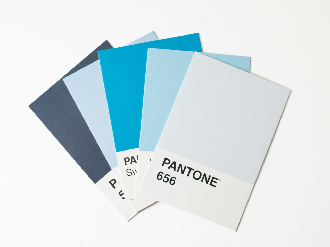
The color palette then gives the system relationships, hierarchy, and rhythm. A primary color is not a medal a brand must wear at all times, and an accent is not a button that has to shout on every screen. Some will use few colors and plenty of space, others a wider range; what matters is that the choice makes sense for the category, the audience, and the situation in which it appears.
Typography works more quietly, but over time. It determines whether text looks like an invitation to a conversation, a technical manual, or a billboard with no intention of stopping. Two or three font families are often a reasonable guideline because they preserve hierarchy and make the system easier to apply, but they are not a law. If a font choice cannot be read on a phone, in a proposal, or on a small label, beauty on a large screen is not enough.
Visual material, photography, illustration, icons, framing, and the way images are treated, carries just as much character. Generic stock photography can fill a gap, but it rarely creates a world of its own. A consistent illustration style, the same line weight, framing, or photographic treatment can say more than another paragraph about “values.” Not every company needs to commission a large series of custom illustrations. It does, however, need to stop choosing each new image as if the previous one never existed.
Then comes tone of voice. A company that speaks calmly and clearly on its homepage, then switches to exclamation marks, urgency, and slang in its newsletter, may look visually tidy, but reads like two different people. Tone is not an add-on after the design. It is as much an element of identity as typography: the same principle of behavior, only expressed through words.
Guidelines and consistency hold all of this together. Not a brand book opened once at the start of a project, but rules clear enough that the next employee, freelancer, or agency does not have to guess. Which version of the logo can they use? What does a headline look like? What kinds of photographs belong to the brand? How do we speak to a person when something is not working? Guidelines do not eliminate judgment. They preserve the basic agreement so that judgment has somewhere to start.
At Duolingo all of that reads as one world: rounded letters, a character that does not feel like decoration, short sentences with rhythm, and colors that do not look like stickers slapped onto a finished product. On the website, in the app, and in its messages, that world remains recognizable. It is not that every surface looks the same. It does not. It is that everything feels as if it was decided under the same light.
Color is not character
At this point, a chart promising a shortcut reliably appears: one color for trust, another for urgency, a third for growth. It sounds tidy, sells easily, and gives the impression that the decision has already been made for you. But color is not an actor’s character. A red costume does not make a character brave; meaning comes from the role, the story, and what the audience sees again.
In their 2014 research review, Elliot and Maier showed something more modest and more useful: colors affect perception, but the effect depends on context, culture, lightness and saturation, product category, and situation. That is not a minor footnote to a universal rule. It is the end of the universal rule. An association that works in one culture or category does not automatically become a law for every company.
That is why popular claims about what a color “means” are not a strategy. They are folklore dressed up as a chart. When a shade is sold to a client as a sure path to a particular emotion, what is being sold is certainty that does not exist. Quiet craft looks different: consider the category, the people you are addressing, the competitive landscape, legibility, accessibility, and what you are already building consistently. Then test the solution at real touchpoints, not on a chart.
Where identity most often breaks down
The crack rarely shows in the first moodboard. It appears later: the logo becomes illegible as a favicon, every presentation picks a different font, social media speaks in one voice and the website in another, photographs jump from sterile to overdone, and a new collaborator makes a version from memory. Another common mistake is copying a current trend with no connection to what the company actually is. The trend passes. What remains is material with no sense of its own measure.
A practical check is not complicated. Gather the website homepage, one post, one proposal, one invoice or email, and a small version of the logo. Cover the company name. Would someone who already knows your work recognize that all those pieces belong to the same place? Then give them to someone who was not involved in creating them and ask what the company promises and how it speaks to people. If the answers depend on the channel, the problem is not that the identity needs more color. The problem is that it needs a shared decision.
An identity is not there to make a company seem more important than it is. It is there so the company does not have to introduce itself all over again every time. When the mark, the image, and the sentence begin to speak in the same voice, a person has enough to make up their own mind. That is already a lot.